
Family Photo Outfits: How to Coordinate Without Matching
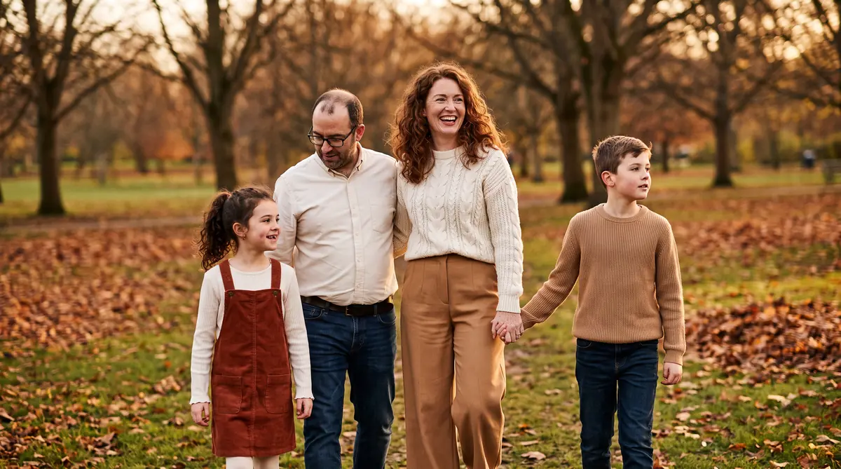
Most family photos don't look dated because of the clothes. They look dated because five people wore the same shirt in the same colour, and the eye has nowhere to travel.
Coordinating means choosing one palette and letting everyone wear something different inside it. Below: the three-colour rule, five palettes that hold up on camera, what a lens actually does to certain fabrics, and worked examples for families of four, five and six.
Coordinate, Don't Match: The Three-Colour Rule
One palette, three tones, five different outfits.
Pick three colours and stop. A dominant neutral that most of the group wears, a mid tone that two or three people share, and one accent that appears on a single person or in small doses like a scarf or shoes.
Nobody wears all three. Each person wears two, in different proportions. That's the whole trick, and it's why coordinated groups look considered while matching groups look like a school trip.
The framework worth remembering is palette, anchor, vary. Palette first, then anchor the group on one person, then vary texture rather than adding colour. A cable knit next to smooth cotton next to denim reads as depth. A fourth colour reads as noise.
The rule: three colours, two per person, nobody in all three.
Start With the Hardest Person to Dress
Not the person most guides tell you to start with.
Almost every guide starts with the mother's dress and works outward. In practice that's backwards, and it often falls apart. You build a beautiful palette around an emerald dress, and on the morning of the shoot the four-year-old will only leave the house in the dinosaur hoodie.
Start with whoever has the fewest genuinely wearable options. Usually that's a young child with strong opinions, a teenager whose wardrobe is three colours deep, or a partner who owns two shirts they like. Find out what they'll actually wear, then build the palette so that garment fits inside it.
This has a second benefit. The person with the least flexibility ends up in something they chose, which means they look comfortable, and comfort shows on a face far more than a well-chosen colour does.
Pro tip: ask the least cooperative person to pick first, from two options you've already approved. It's the same choice, framed as theirs.
Five Palettes That Photograph Well
Muted beats bright on almost every camera.
| Palette | Neutral | Mid tone | Accent | Best for |
|---|---|---|---|---|
| Warm earth | Cream | Camel | Rust | Autumn woods, golden hour |
| Cool coastal | Oatmeal | Dusty blue | Soft white | Beach, dunes, overcast light |
| Garden green | Ivory | Sage | Chocolate | Parks, gardens, spring |
| Quiet neutral | Bone | Taupe | Black | Studio, city, home |
| Deep winter | Charcoal | Burgundy | Camel | Snow, evening, holiday cards |
Slightly desaturated versions of these hold up better than the pure versions. A dusty blue photographs as blue; a bright royal blue photographs as a blue light source, and it lands on the chin of whoever is standing next to it.
If choosing between palettes is where you stall, our colour analysis guide helps you work out which family of tones suits the skin in your group before you commit.
What the Camera Does to Your Clothes
Four things that behave differently on a lens than in a mirror.
Tight repeating patterns are the one most people are caught out by. Thin stripes, small gingham and fine herringbone can interfere with the sensor's pixel grid and produce moiré, a shimmering rainbow ripple across the fabric. It's not fixable in editing without damaging the image. Larger patterns are fine.
Neon and heavily saturated colours bounce. A lime green shirt throws green light onto the underside of the chin of the person wearing it, and often onto whoever is standing beside them.
Pure white next to deep black forces the camera to choose. Either the white blows out and loses all detail, or the exposure drops to save it and the faces go dark. Cream and charcoal do the same job without the fight.
Then there's the logo problem. Nothing dates a photograph faster than a visible brand mark, because it stamps the image with a specific year. Graphics on children's clothes are the usual culprit.
The fix: if you can read words on it from across the room, change it.
Worked Examples: Four, Five and Six People
Three group sizes, fully dressed.
- Family of four, autumn park. Warm earth palette. Mum: cream cable knit, camel wide-leg trousers, brown boots. Dad: cream oxford shirt, dark denim, brown boots. Older child: rust corduroy pinafore over a cream long-sleeve tee. Younger child: camel knit jumper, dark denim. The accent colour appears once, on the smallest person, which is also where the eye should land.
- Family of five, coastal, overcast. Cool coastal palette. Two adults in oatmeal knitwear with one in a dusty blue shirt underneath. Three children split across soft white and dusty blue, with one in oatmeal so the group doesn't split cleanly into two teams. Bare feet or plain trainers, never white socks with sandals.
- Family of six, at home, winter. Deep winter palette. Grandparents in charcoal, parents in burgundy and charcoal, two children in camel. The lightest tone sits on the smallest people so they don't disappear against furniture. Textures do the work: velvet, brushed cotton, chunky knit.
Six people is the point where a fourth colour starts to feel necessary. Resist it. Add a fourth texture instead.
Location Sets the Palette
The background is already wearing a colour. Don't fight it.
| Location | Background tone | Works | Avoid |
|---|---|---|---|
| Autumn woods | Orange, brown, gold | Cream, camel, rust, olive | Bright orange, red |
| Beach or dunes | Pale sand, grey sky | Oatmeal, dusty blue, white | Dark heavy colours |
| Green park | Saturated green | Ivory, sage, chocolate, denim | Bright green, busy florals |
| City street | Grey, concrete, brick | Camel, black, bone, denim | Grey on grey |
| At home | Whatever your sofa is | Match your own room's tones | Clashing with the walls |
The city one catches people out. Grey coats against grey concrete on a grey day gives you a photograph of a wall. One warm tone in the group, even just a camel scarf, is what separates the people from the background.
What Goes Wrong
Matching tops. Five people in identical white shirts and jeans reads as a uniform, and it's the single most common mistake.
Buying everything new. Photos where all six outfits are brand new tend to look stiff, because nobody has worked out how the clothes sit yet. Mixing in pieces people already wear well is why some families look relaxed and others look posed.
Ignoring shoes. They're in most full-length frames and they're the first thing people forget. Scuffed white trainers are visible from a surprising distance.
Leaving it to the morning of. Trying five combinations on five people an hour before a shoot is how the dinosaur hoodie wins.
Bottom line: decide the palette a week out, hang each outfit together, and photograph them on hangers so you can see the group before the group exists.
Getting It Right Before the Shoot
The most useful thing you can do is see the outfits together before the day, because a palette that works on paper occasionally falls apart in fabric. Laying them out is one way. Tools like Klodsy let you try the pieces on your own photo first, which is faster than a fitting and cheaper than a set of prints you don't like.
Start with the palette table, pick the row that matches your location, then dress the hardest person first. Everything else follows in about twenty minutes.
For seasonal specifics, our fall outfit ideas covers the autumn palette in more depth, cardigan outfits handles the layering piece most family shoots rely on, and plus size outfits applies the same proportion logic across a wider range of shapes.
Try Klodsy free and see the whole group's outfits before the photographer arrives.
Related Articles
Should I Wear a Jacket Today? Temperature Chart + 5 Checks
Should you wear a jacket today? Use the temperature chart, then check wind, rain, sun and activity to choose the right jacket, from 70°F down to freezing.
What to Wear to a World Cup Watch Party in 2026
What to wear to a World Cup watch party in 2026. Jersey styling, team colors without the costume, bar vs backyard vs fan zone, summer heat, and what to skip.
World Cup Outfit Ideas 2026: What to Wear to a Match
World cup outfit ideas for the 2026 tournament. Stadium-ready looks for women and men, summer heat dressing, jersey styling, shoes, bags, and what to skip.
Frequently Asked Questions
Everything you need to know about this topic
Pick three colours maximum: one dominant neutral, one mid tone and one small accent. Muted, slightly desaturated versions photograph better than bright ones because they don't reflect colour onto skin. Cream, camel, sage, dusty blue and rust are reliable across most locations.